6 Health Adjusted Life Expectancy (HALE)
One important method of assessing the health of a population is to ask how long people can expect to live.
Life expectancy, estimate of the average number of additional years that a person of a given age can expect to live. The most common measure of life expectancy is life expectancy at birth. Life expectancy is a hypothetical measure. It assumes that the age-specific death rates for the year in question will apply throughout the lifetime of individuals born in that year. The estimate, in effect, projects the age-specific mortality (death) rates for a given period over the entire lifetime of the population born (or alive) during that time. The measure differs considerably by sex, age, race, and geographic location. Therefore, life expectancy is commonly given for specific categories, rather than for the population in general.
Life expectancy reflects local conditions. In less-developed countries, life expectancy at birth is relatively low, compared with more-developed countries. In some less-developed countries, life expectancy at birth may be lower than life expectancy at age 1, because of high infant mortality rates (commonly due to infectious disease or lack of access to a clean water supply).
A life table is a table which shows, for a person at each age, what the probability is of them dying before their next birthday. From this starting point, a number of statistics can be derived and are also included in the table:
- the probability of surviving any particular year of age
- the remaining life expectancy for people at each age
- the proportion of the original birth cohort still alive.
Life tables are usually constructed separately for men and for women because of their substantially different mortality rates. The Office of National Statistics is one organisation which produces life tables.
Health Adjusted Life Expectancy (HALE):
HALE is a measure of population health that takes into account mortality and morbidity. It adjusts overall life expectancy by the amount of time lived in less than perfect health. This is calculated by subtracting from the life expectancy a figure which is the number of years lived with disability multiplied by a weighting to represent the effect of the disability.
If:
A = years lived healthily
B = years lived with disability
A+B = life expectancy
Healthy life expectancy (HALE) is a form of health expectancy that applies disability weights to health states to compute the equivalent number of years of good health that a newborn can expect.
Overall, global HALE at birth in 2015 for males and females combined was 63.1 years, 8.3 years lower than total life expectancy at birth. In other words, poor health resulted in a loss of nearly 8 years of healthy life, on average globally. Global HALE at birth for females was only 3 years greater than that for males. In comparison, female life expectancy at birth was almost 5 years higher than that for males.
HALE at birth ranged from a low of 51.1 years for African males to 70.5 years for females in the WHO European Region. The equivalent “lost” healthy years (LHE = total life expectancy minus HALE) ranged from 13% of total life expectancy at birth in the WHO African Region to 10% the WHO Western Pacific Region
(“https://www.healthknowledge.org.uk/e-learning/health-information/population-health-specialists/lifetables-hales-dalys-pylls#:~:targetText=Health%20Adjusted%20Life%20Expectancy%20(HALE,in%20less%20than%20perfect%20health.”)
(“https://www.britannica.com/science/life-expectancy”)
(“https://www.who.int/gho/mortality_burden_disease/life_tables/hale_text/en/”)
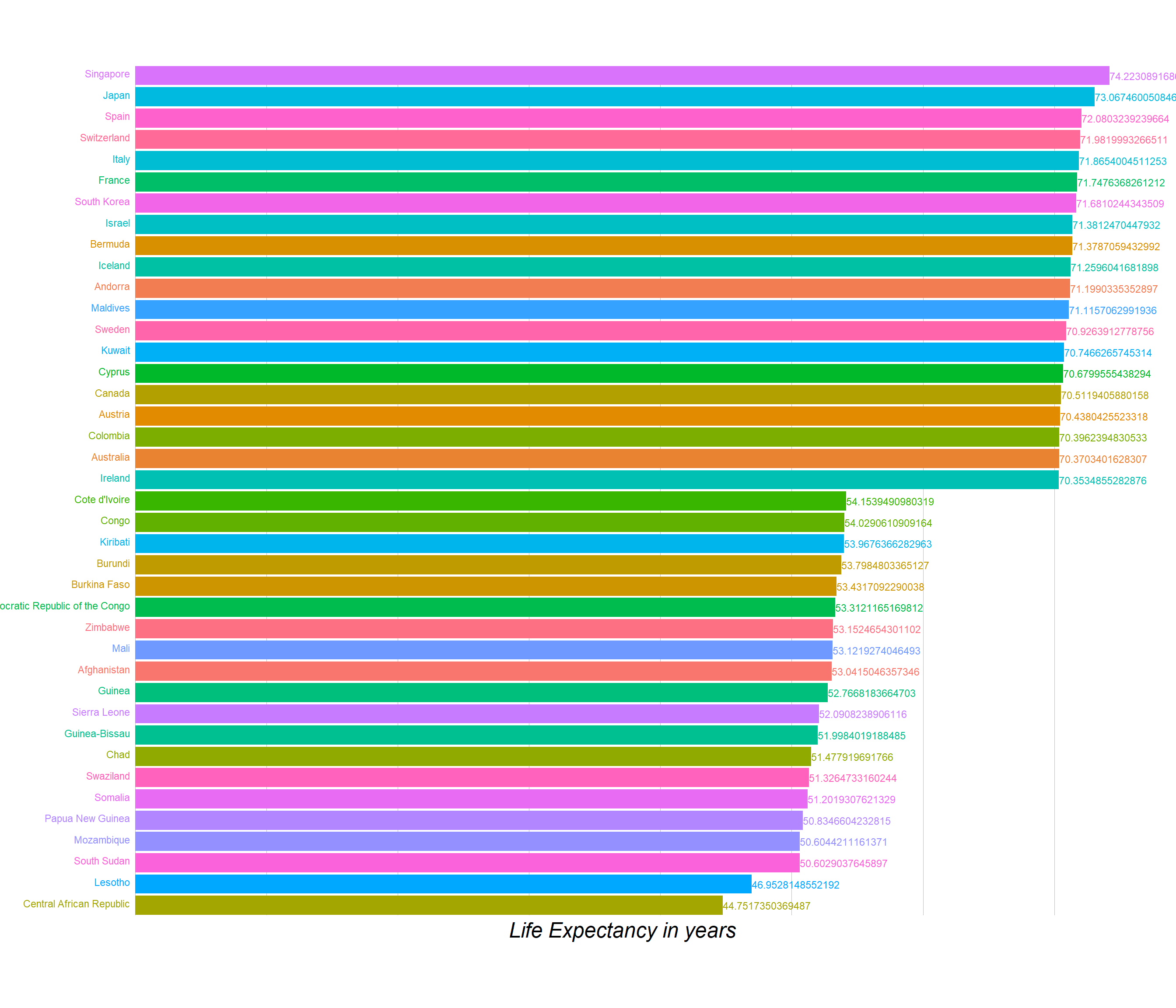
Below is the plot for the HALE values for the year of 2017. Hover over the points to see the country name. The plot is ordered in the decreasing order the HALE values.
After rank ordering the countries by the HALE values, we selected to create an animation for top 10 and last 10 countries for showing the transition intheir values over the period of years 1990 to 2017.
Now, let’s shift gears towards analyzing the HALE values for different genders over the countries. Below is the plot showing similar information as the first one, but here we have seperated the values for different genders and as can be seen for almost each country there is a clear trend of females having more HALE as compared to males. STRANGE thing for such a spectacular pattern to exist over all the countries!
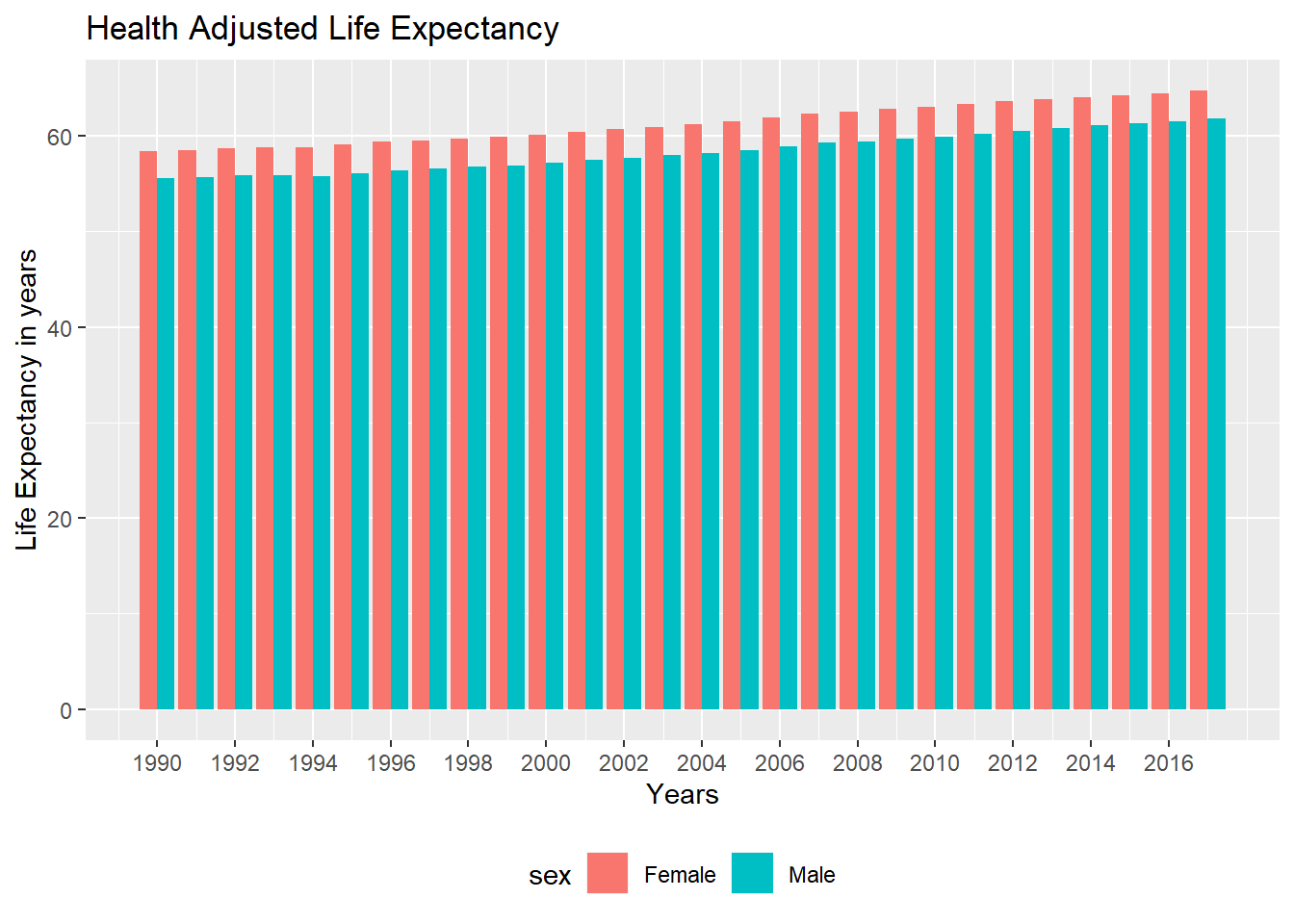
From the below drawn line and barcharts also it is a clear trend that the HALE values for females have been higher than the ones for males since 1990s and the trend has remained the same over the period of years.
Combining the trends for all countries we now show the plots for the values of HALE over the world chloropeth for the year 2017. We have seperated the choropleths into 3 components.
1- having average values of HALE for both the genders
2- For Females
3- For Males
Although we get the same insight as from the above graphs and that from looking at the legends that the overall HALE values for females is larger globally. We cannot compare the values countrywise here as there scales are continous and the ranges for both of them being different it is very hard to guage the difference in the values for each of those.
On looking up for what might be the reasons for females having higher HALE than male and referring to various articles, these were the reasons that might be the ones resulting into such results:
1- The female advantage in life expectancy is partly, but not entirely driven by higher chances of surviving childhood.
Accessible proof shows that youngster death rates in the present rich nations were higher for male than female babies in the nineteenth century, and the male inconvenience in child mortality became through the primary portion of the twentieth century, as wellbeing results improved. Essentially, maternal mortality in these nations used to be extremely high, and it diminished drastically over the twentieth century. Changes in child and maternal mortality do affect future contrasts among people, however, they can’t completely clarify the ascent in the life span hole that we’ve seen in rich nations in the course of the only remaining century.
2- Biological differences can also be part of the story.
The proof shows that distinctions in chromosomes and hormones among people influence life span. For instance, males will, in general, have increasingly fat encompassing the organs (they have progressively ‘visceral fat’) though females will, in general, have increasingly fat sitting legitimately under the skin (‘subcutaneous fat’). This distinction is resolved both by estrogen and the nearness of the second X chromosome in females, and it is important for life span since fat surrounding the organs predicts cardiovascular ailment.
3- Freely of the definite weight, we realize that in any event part of the motivation behind why females live such a great amount of longer than men today, yet not before, has to do with the way that some key non-biological elements have changed. What are these evolving factors? Some are outstanding and moderately direct, similar to the way that men smoke all the more frequently. Others are increasingly confounded. For instance, new proof shows that in rich nations the female bit of leeway expanded to some degree on the grounds that irresistible sicknesses used to influence ladies excessively a century prior, so propels in medication that diminished the long haul wellbeing trouble from irresistible ailments, particularly for survivors, wound up raising ladies’ life span lopsidedly.
194 codes from your data successfully matched countries in the map
1 codes from your data failed to match with a country code in the map
49 codes from the map weren't represented in your data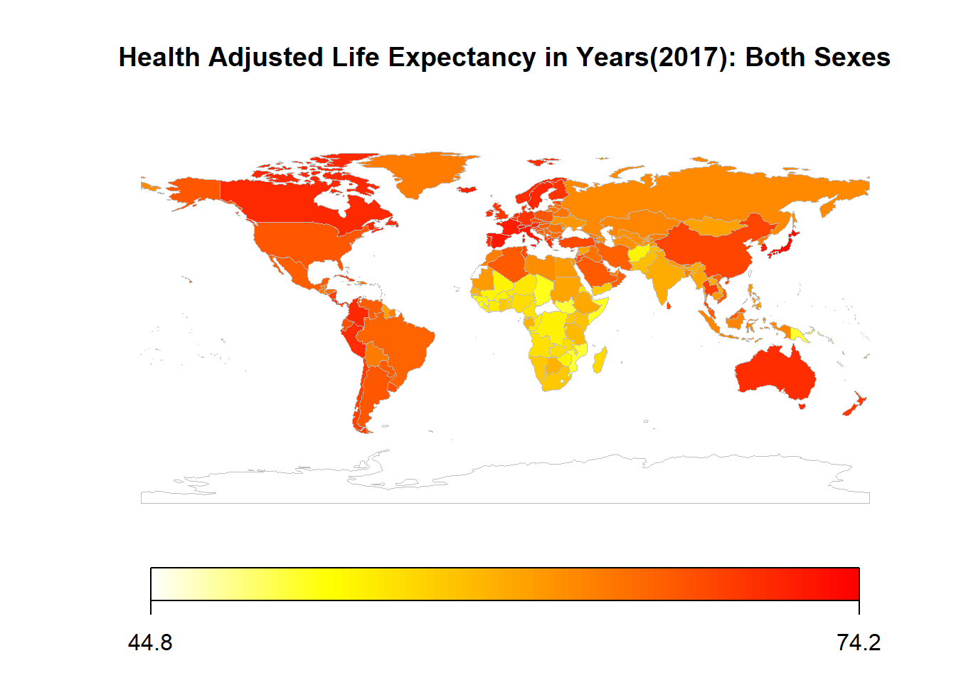
194 codes from your data successfully matched countries in the map
1 codes from your data failed to match with a country code in the map
49 codes from the map weren't represented in your data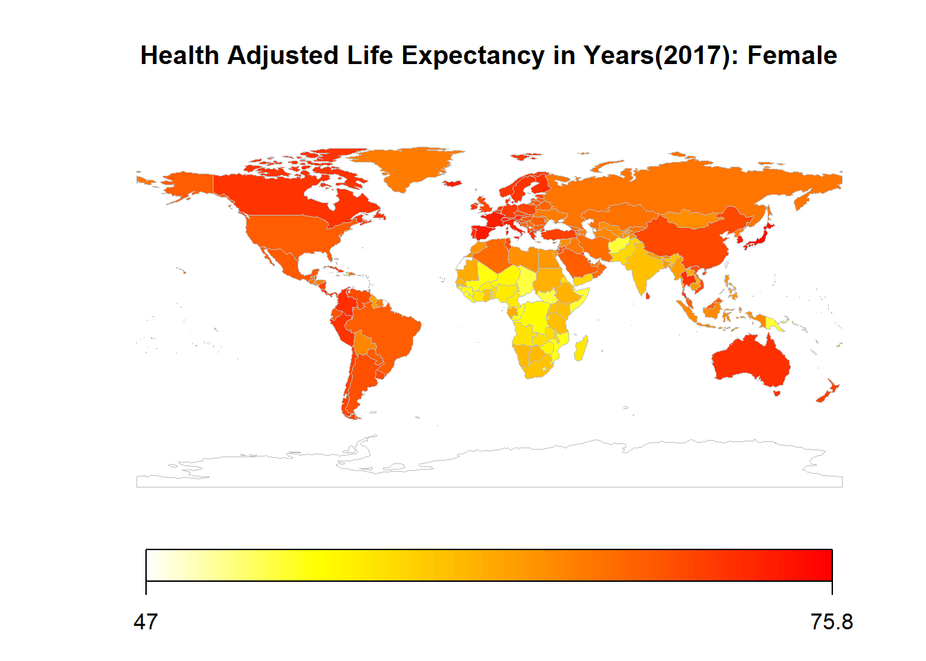
194 codes from your data successfully matched countries in the map
1 codes from your data failed to match with a country code in the map
49 codes from the map weren't represented in your data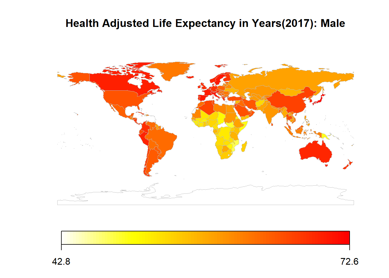
If, we focus on the 4 countries (United States, India, Canada and Zimbabwe) we get the plots as shown below.
1- The values of HALE for United States are increasing till and then slightly decreasing after the rate of change becomes constant in 2013. The decrease might be due to the effects of global warming affecting the life expectancy of people living in the United States. Also, recenlty in last few years USA has been facing many natural disasters and the decrease might be a result of those as well.
2- The values of HALE for India are increasing at kind of constant rate which is higher than that of Canada but as Canada has already started it from a higher value it is reasonable to not have a higher increase rate.
3- The values of HALE for Zimbabwe is decreasing and is increasing on latter then after 20089. This might be due to various kinds of epidemics that would have resulted in people not being considered as healthy and hence reducing the overall HALE values. A cholera epidemice as for example was prevelant in Zimbabwe in the year 2008. (
https://www.hhrjournal.org/2017/07/the-cholera-epidemic-in-zimbabwe-2008-2009-a-review-and-critique-of-the-evidence/)Folowing graph show the change in HALE over different countries throughout the years from 1990 to 2017. The choropleth shows that the shades for each and every country are getting darker respectively for each country showing the overall increase in the value of HALE for each country.The color difference over the period of years for developed countries as compared to the ones which are classified as developing ones can show an insight for the amount of development that has been taking place in countries.