5 Mortality Rate (Number of Deaths) Analysis
First we start by understanding the overall trend of the data by plotting a line graph with the all the data we currently have with us.
We can cleary see in this plot that the number of deaths in all parts of the world is decreasing.
Especially if we look at some European countries like France, Spain and Italy. We can see that the number of deaths has drastically decreased from the years 1850 to the current year. One of the reasons behind this could be the World Wars due to which a lot of lives were lost.
To understand if people are actually living longer or no, we analyse the data on Health Adjusted Life Expectancy in the next page.
After doing some more research on this topic, we found out more data on the United Nations website. We use this data to plot an animated cartogram and an animated choropleth of the entire world.
Before we jump into making the choropleths and cartograms, we would like to analyse the number of deaths by the economy and income group of the countries. Does the economy or income group of the country actually affect the deaths in that country? And has the pattern changed over the last 25 years? Lets see.
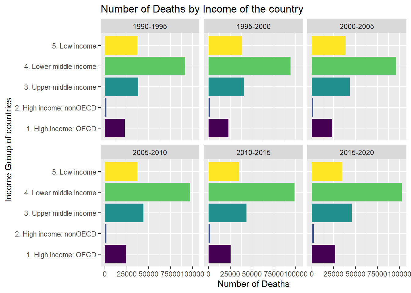
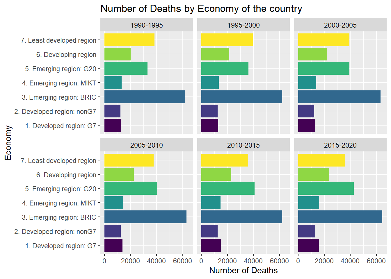
We can clearly see here, that the economy and income group of a country actually does affect the number of deaths in the country. This is not surprising as the healthcare facilities might not be as good in a still developing country as compared to a fully developed country.
But, what is surprising to see is that the pattern has not changed over the years.
In the past 25 years the pattern almost remains the same.
One possible explanation for this might be the actual population of the countries. As the total population of the countries is increasing, and the trend is that the population of developing countries is way higher than the developed ones. Due to a high population increase, the deaths also might have increased and the because of which we are not seeing any difference in the patterns here.
Spatial Analysis!
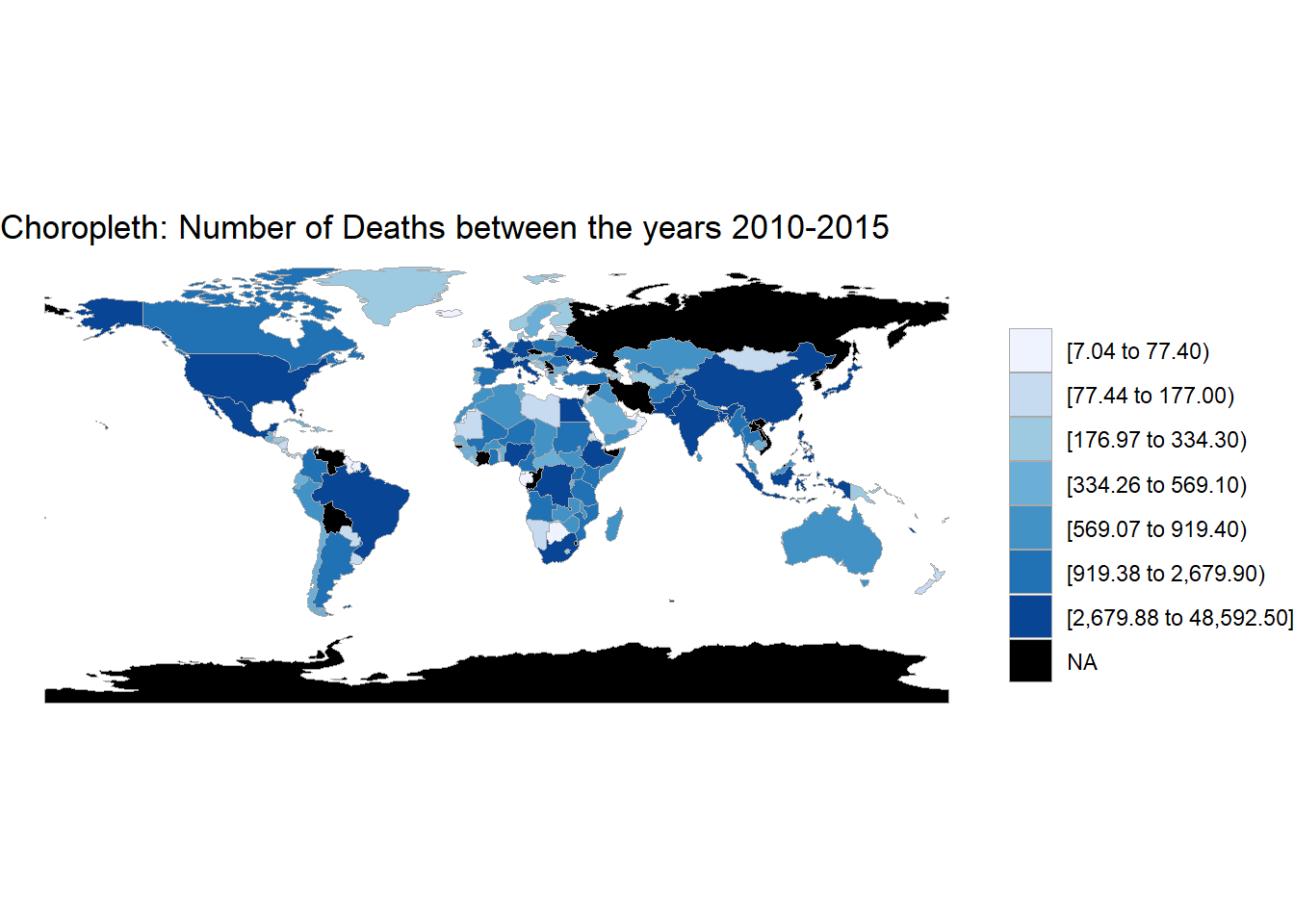
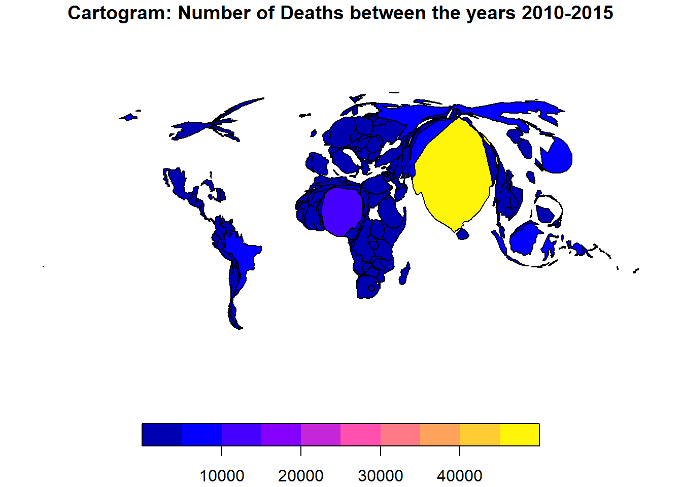
These are some static plots we made to understand the current situation of mortality in the world.
But wouldn’t it be great to see an animated plot, where the number of deaths in each country is changing as the years pass by.
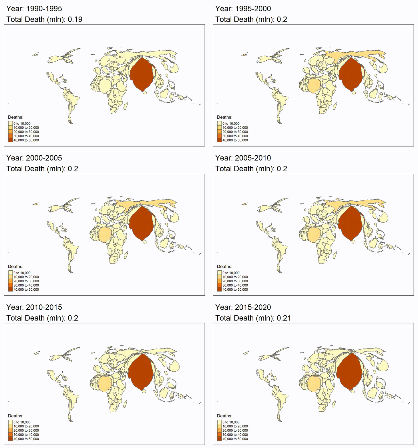
Here we can clearly see that the total number of deaths in the world are mainly in the asian countries like India, China and some african countries.
The main reason behind this could be because of the huge population of these countries.
Nevertheless, we can see some changes in the cartogram, which means that the number of deaths is decreasing slightly as time progresses.